Visualizing Data for
the Visually Impaired
Project created in the Alternate Climate Visualizations course at the Royal Danish Academy with Joost Grootens.
the Visually Impaired
Project created in the Alternate Climate Visualizations course at the Royal Danish Academy with Joost Grootens.
Research
Data Visualization
Silk Screen Printing
Data Visualization
Silk Screen Printing
Course research question included: How can information visualizations convey climate change while questioning their own inevitable rhetoric as a means of communication, as well as, questioning the inherent assumptions we have about information, the environment, and the world?
My personal research question: How does one visualize in a non-visual way and make it an enriching experience?
Most graphs and charts are not inclusive enough towards people who are blind or visually impaired. Even with existing tools like screen readers or providing alternate text descriptions, lots of information is still lost or missing. There are not many physical representations of data for the non-visual (ex: using 3D, texture, or Braille). I wanted to change that.
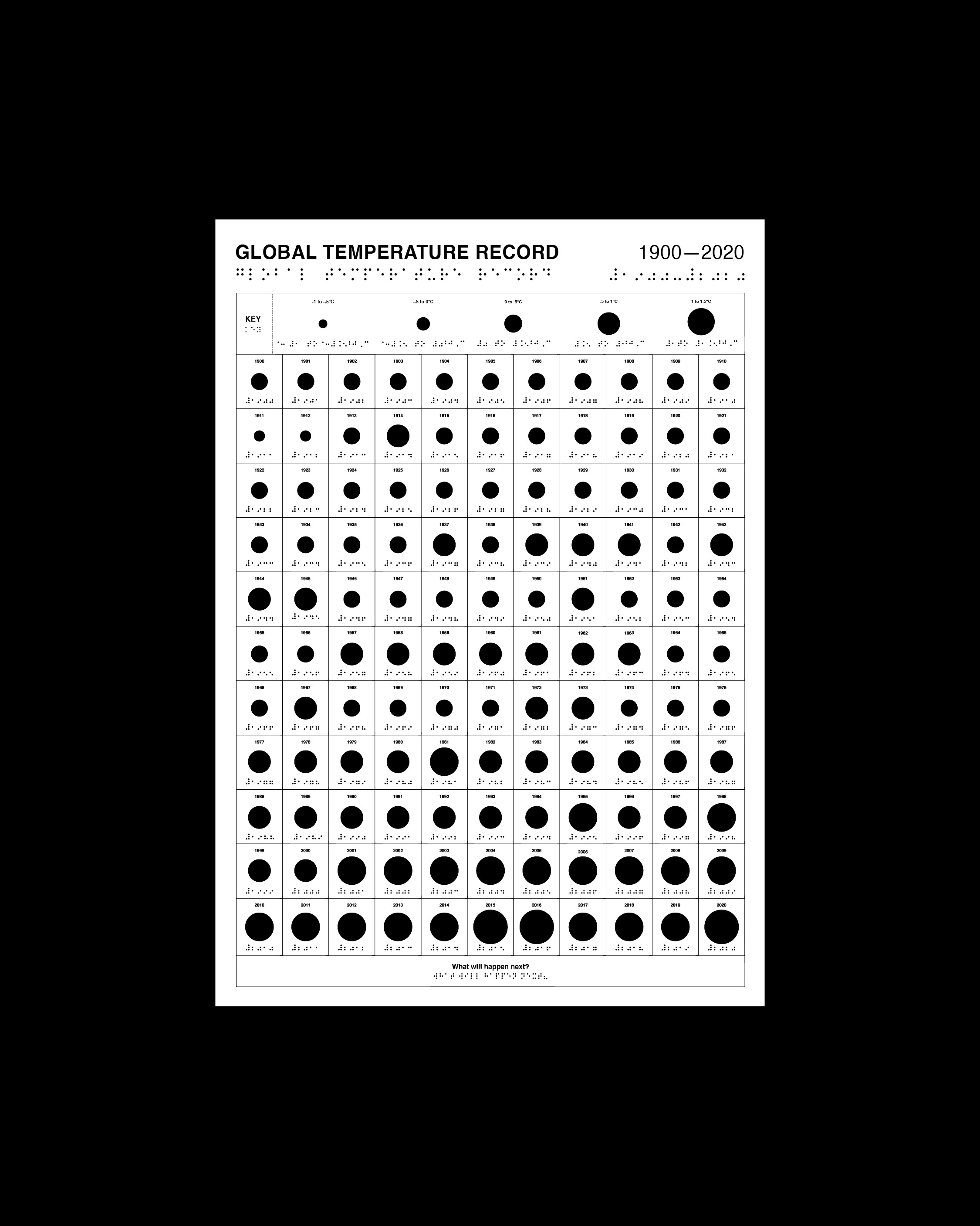
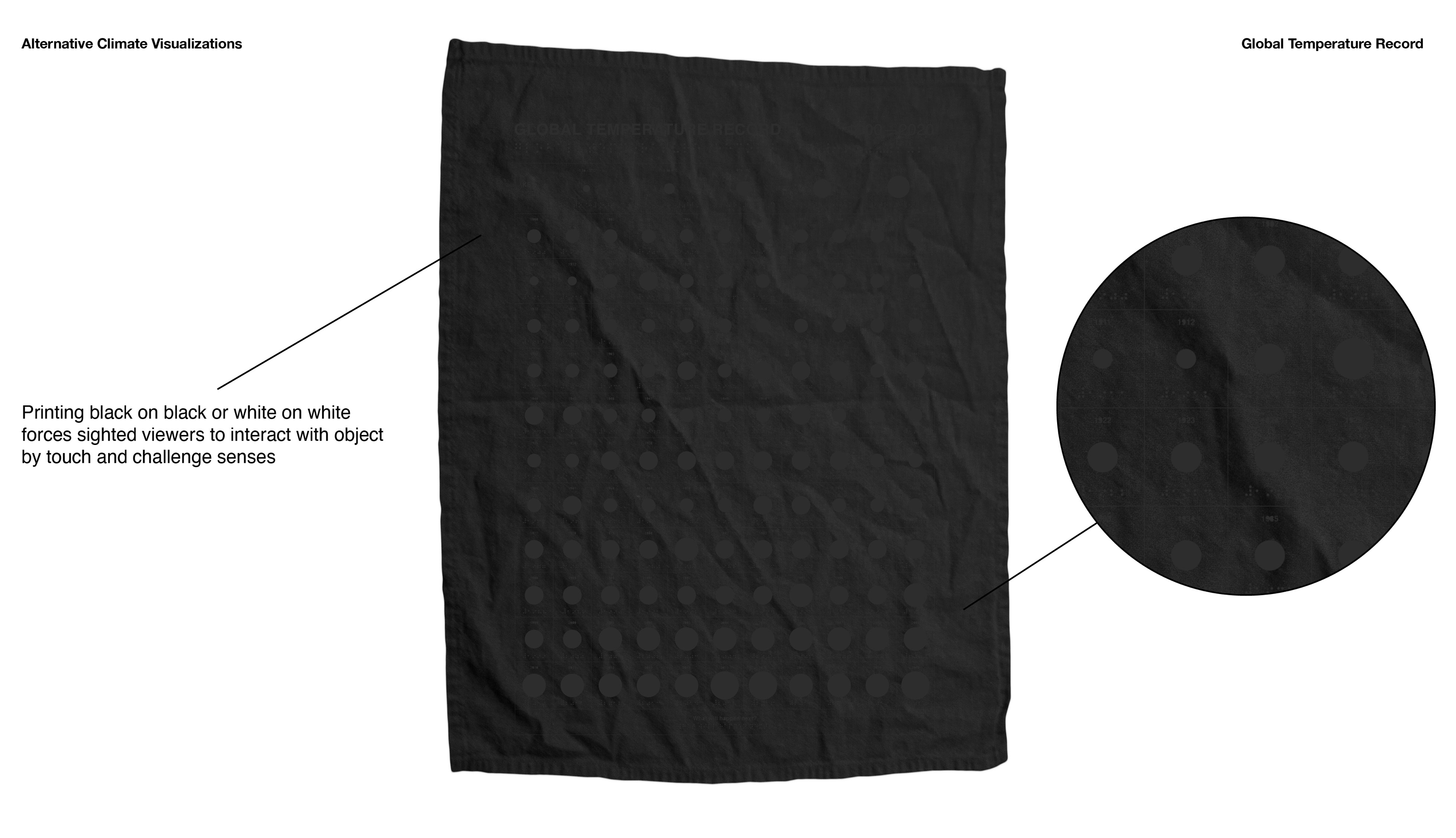
The goal of this project was to create an interactive and inclusive data visualization for visually impaired and blind people to experience the effects of climate change through touch.
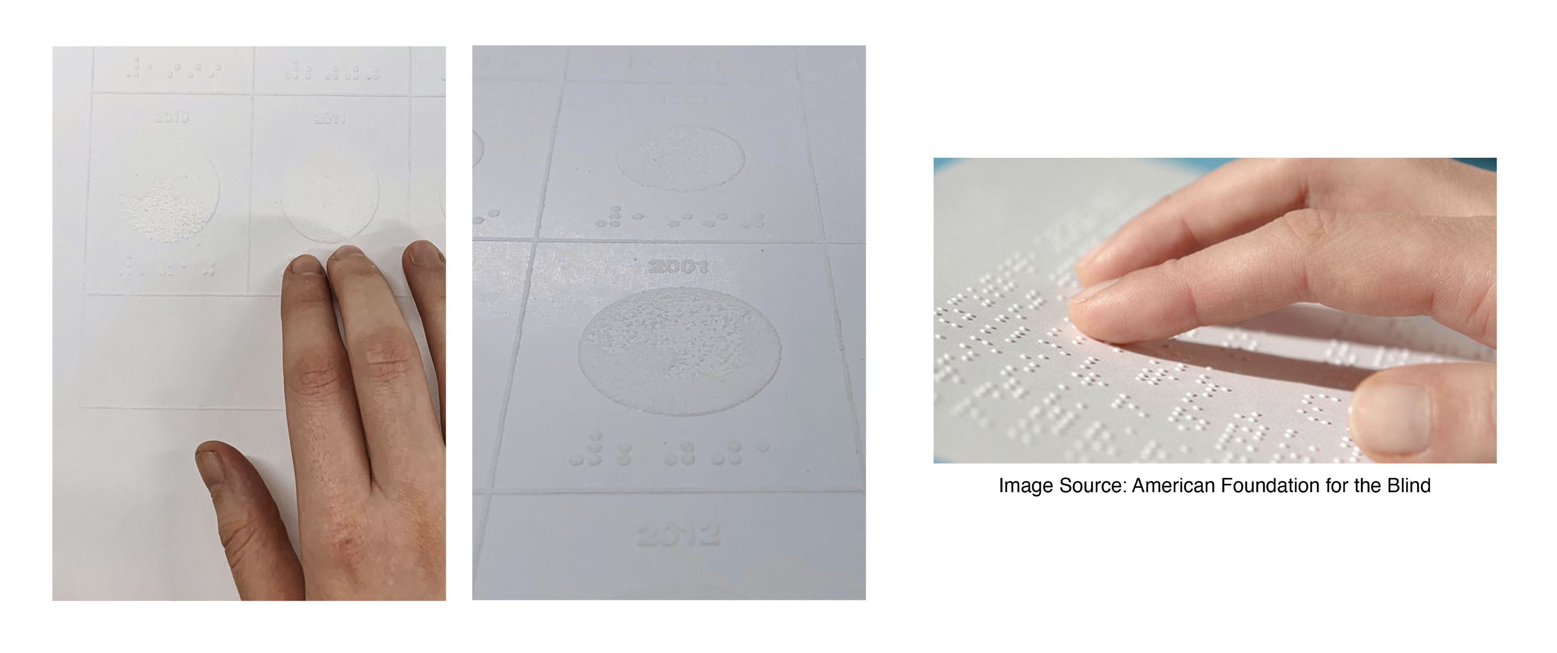
The original data is taken from the Global Temperate Record created by the 2 Degrees Institute. In my new data visualization, the data is transformed into Braille and read from left to right. The user can feel the rising temperatures through the introduction of rising circular shapes. Instead of using color to see the difference through time, texture is used to feel the rise in temperature over time. The added element of the year helps create a sense of structure for the user and allows it to be properly read from left to right.
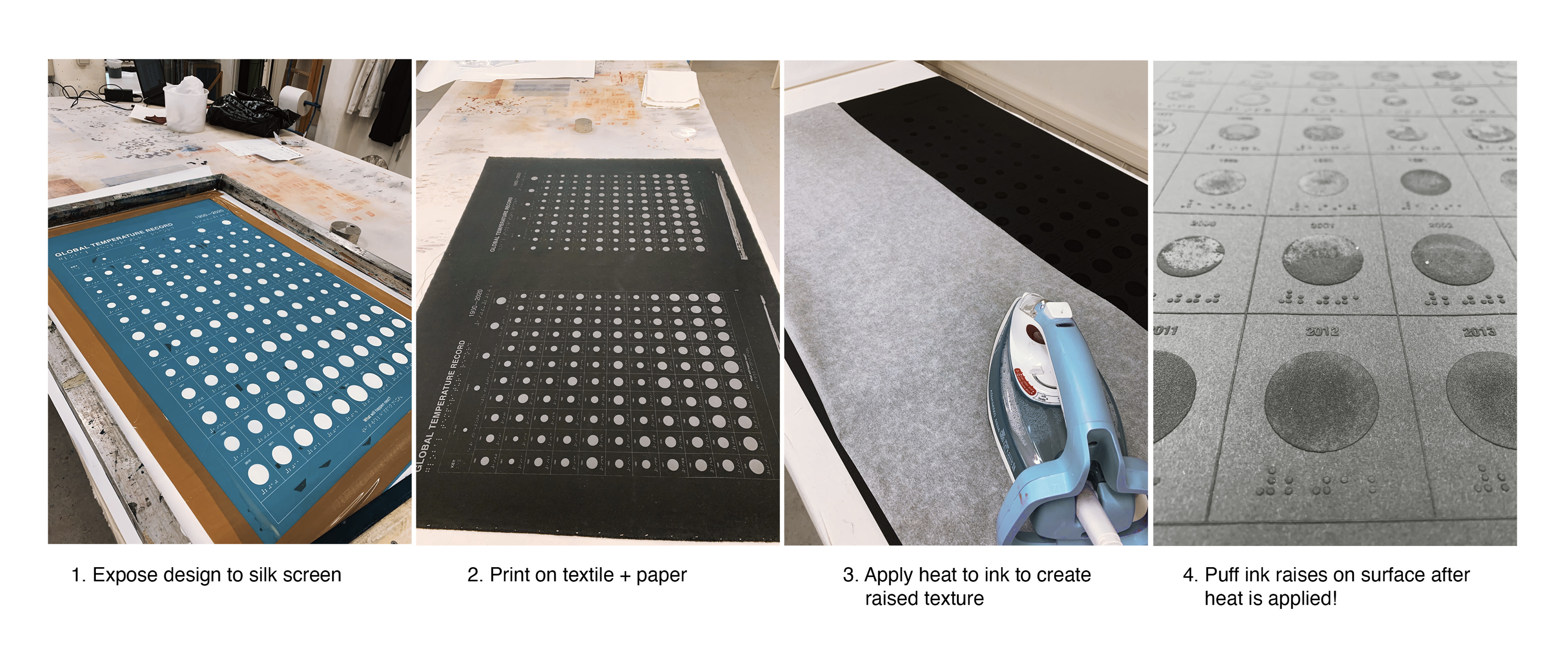
*Project still in testing - ideally meant to be created as a large-scale poster using machines formatted for Braille embossing in order to provide the most accurate end product for blind or visually impaired users. Scroll down to see process through silk screen.
Read full university report and process here.


 Silk Screen Printing - With a student budget and limited time, proper Braille embossing was not an option. I decided to get creative and with home-made testing to find a way to make a similar 3D raised texture to Braille. The result of puff ink with silk screen printing created a good starting point.

